The growing hard seltzer category is dominated by a few pioneering brands. As consumers look for refreshing alternatives to their regular tipple, there has been an ever-growing emergence of copy cats replicating the same design formula.
THE CHALLENGE
Create a hard seltzer brand that has a refreshing take on the category norms, but still has a nautical story to tell.
THE SOLUTION
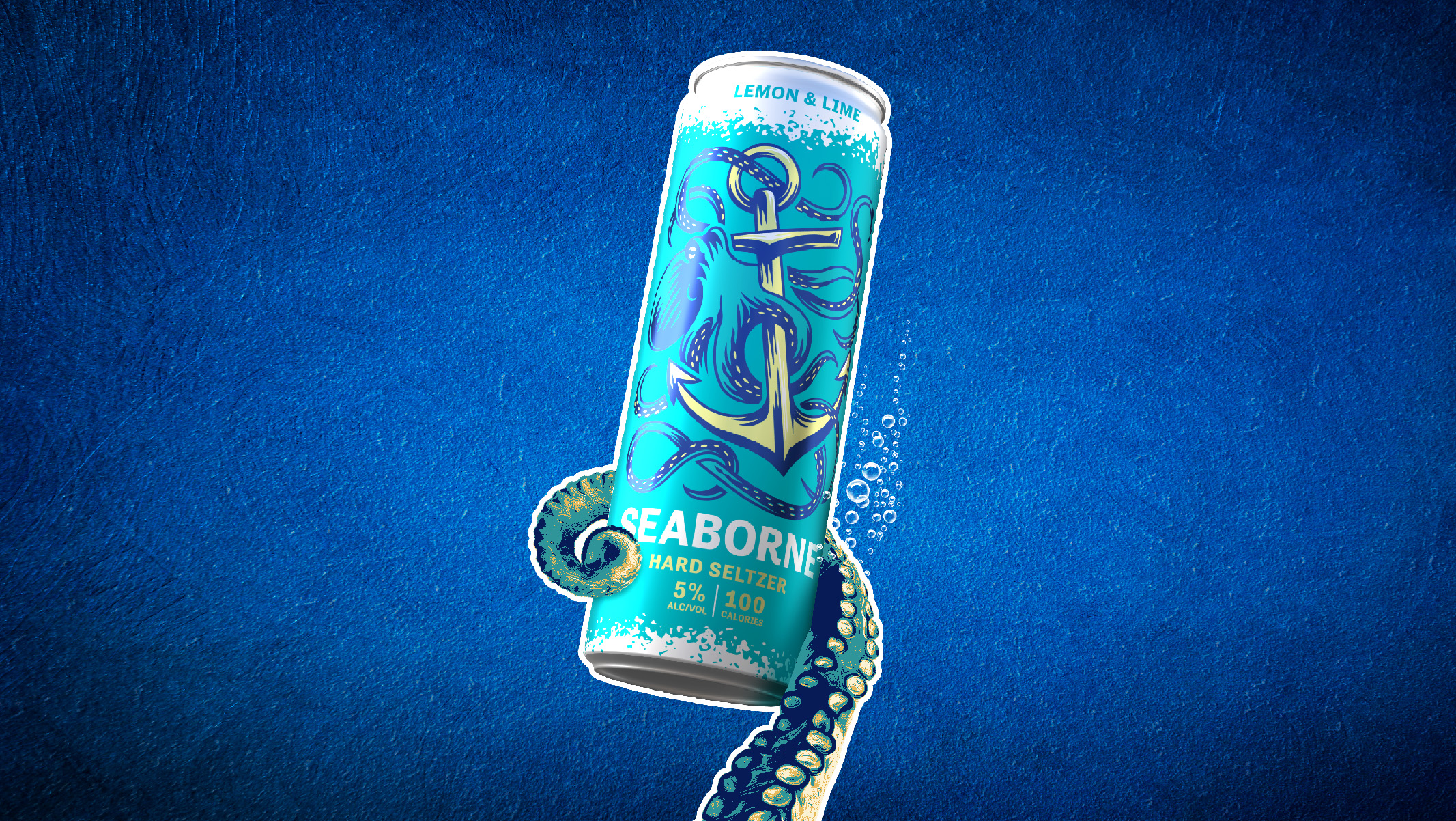
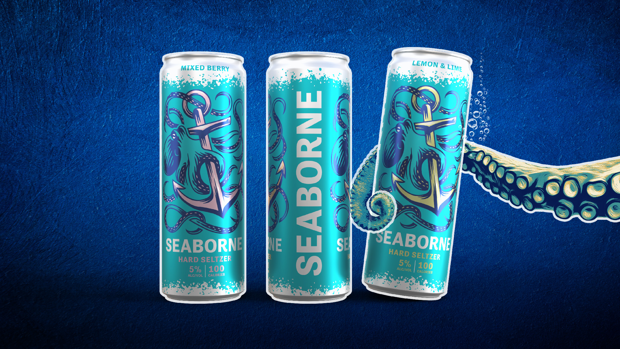
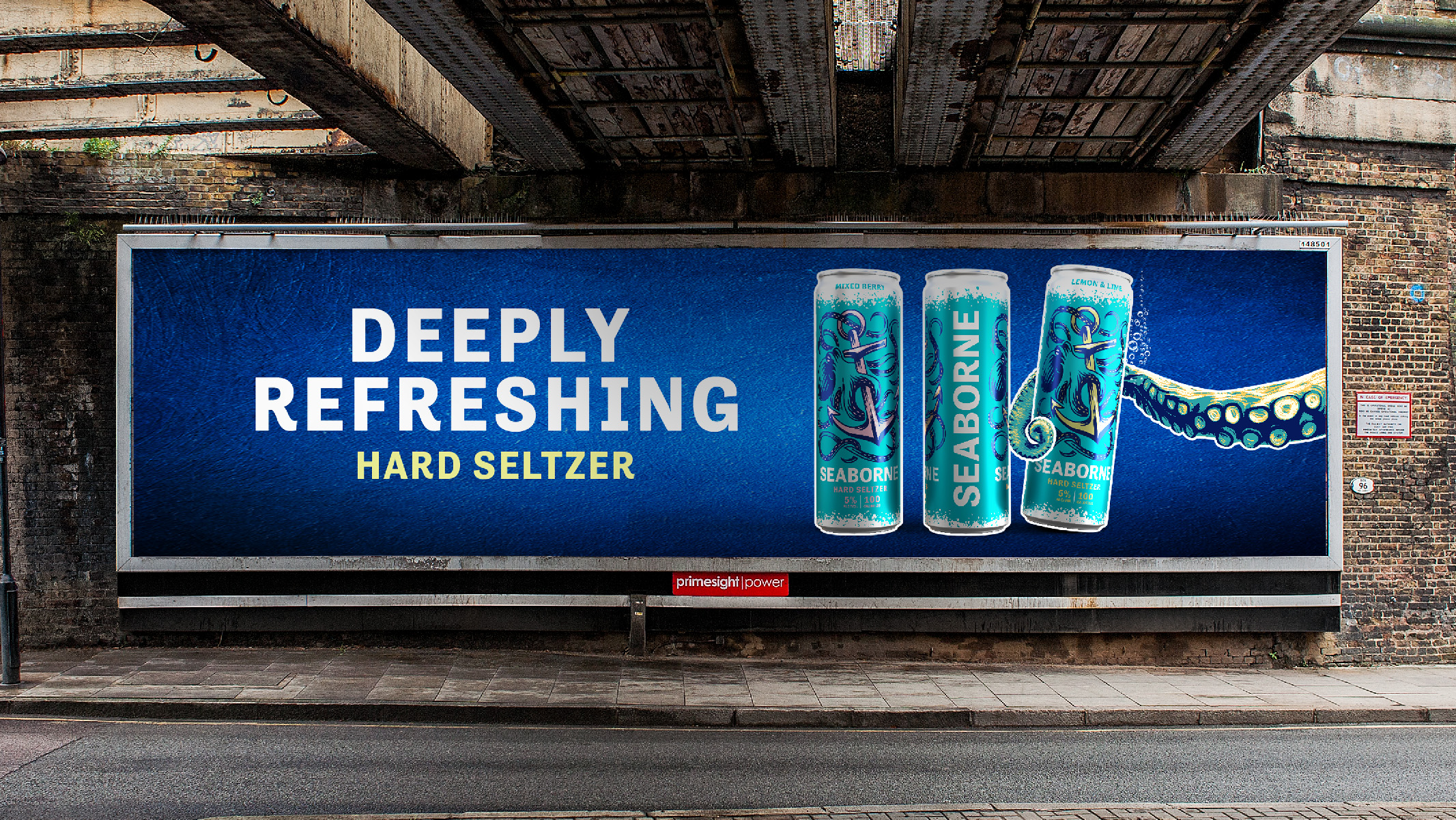
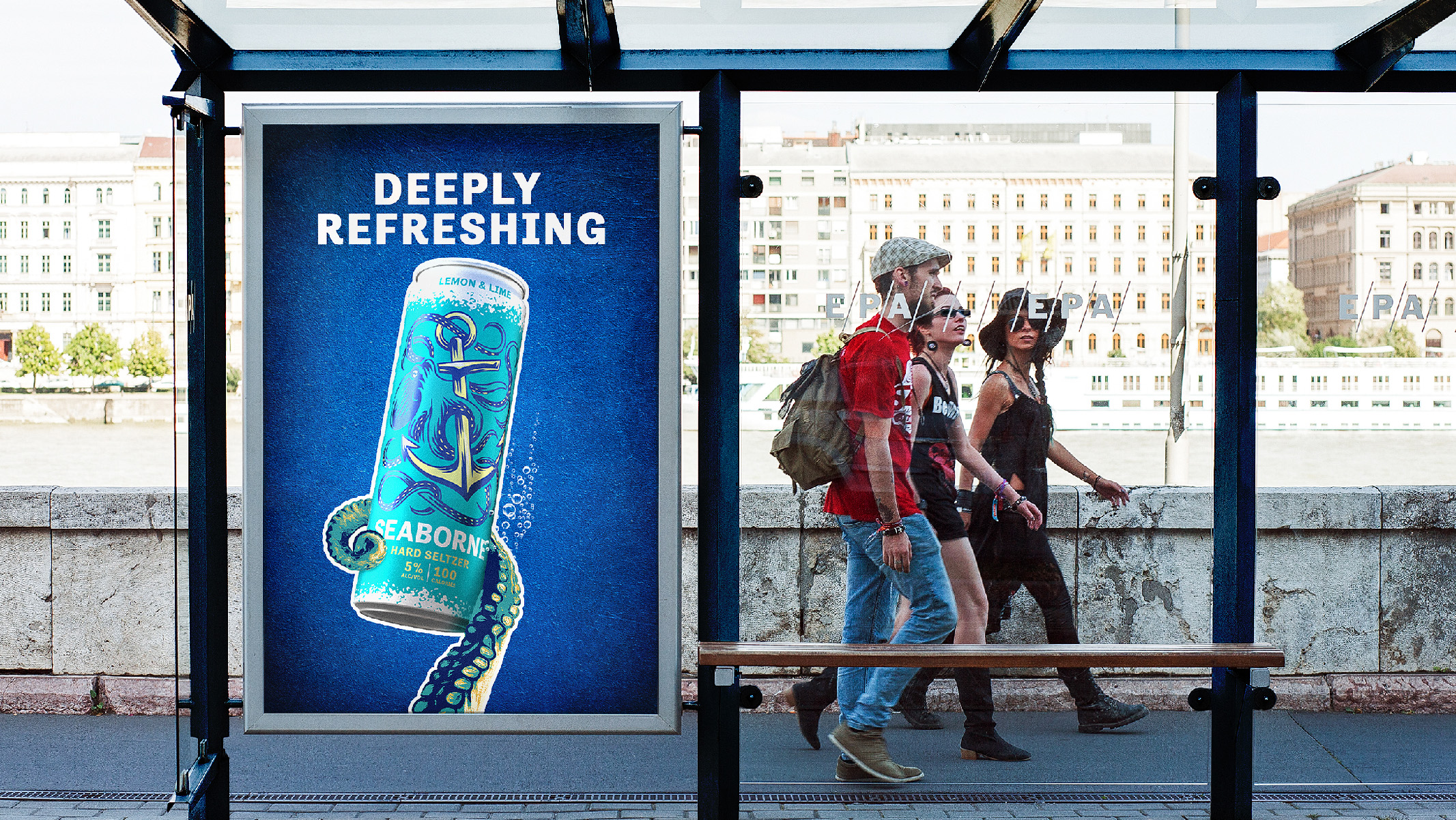
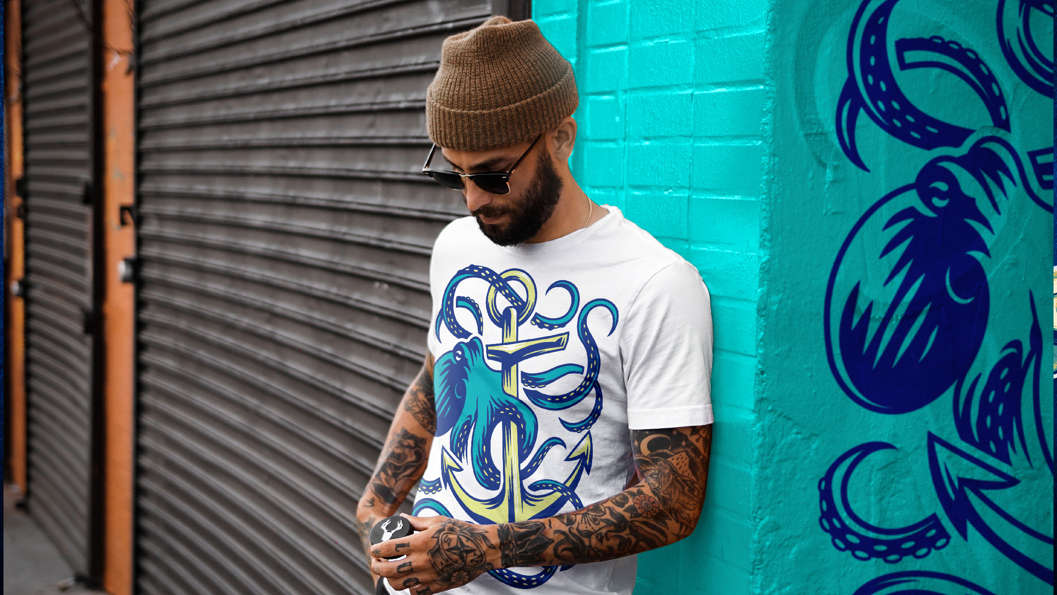
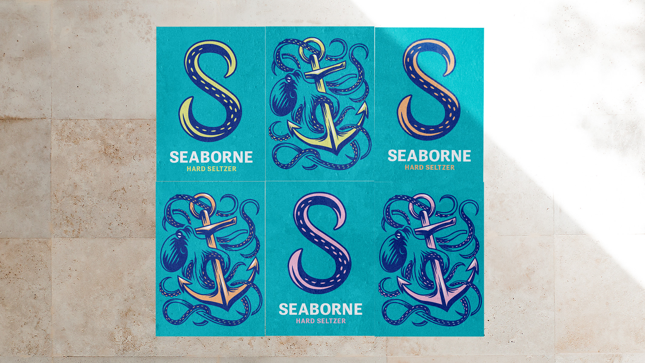
The name ‘Seaborne’ was chosen as a nod to the founders’ shipping background, which then led us to the idea of ‘Deeply Refreshing’. The kraken entangled around a ship’s anchor became the symbol to express this idea, we paired this icon with a vibrant colour palette. The result is a bold brand that stands out from the passive crowd.